

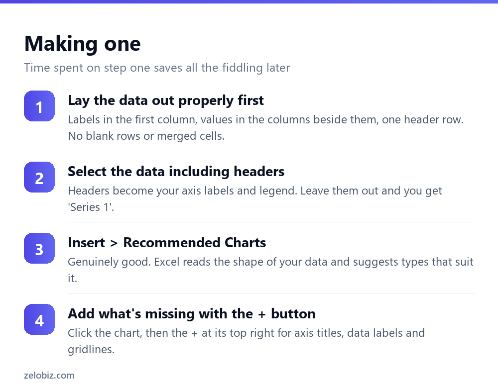
To make a graph in Excel, select your data including the headers, then go to Insert › Recommended Charts and pick one. The harder question is which chart: use a line for change over time, column for comparing categories, bar when the category names are long, scatter to show whether two numbers relate, and pie only for parts of a single whole with five slices or fewer.
Lay the data out first
Most charting problems are data problems. Excel builds the chart from the shape of what you selected, so if the layout is awkward the chart will be too, and you’ll spend twenty minutes in Select Data trying to fix something that took thirty seconds to cause.
What Excel wants is straightforward: one header row, labels in the first column, values in the columns to the right, and no blank rows, no merged cells, no subtotals mixed in with the detail.
Subtotal rows are the one people miss. Leave a ‘Total’ row inside the selection and it becomes a bar four times taller than everything else, flattening the differences you actually wanted to see.
If the chart looks wrong, look at the data layout before you touch a single chart setting.
Choosing the right type
This is the whole job, and it’s where most charts go wrong. Excel will build whatever you ask for, including things that actively mislead.
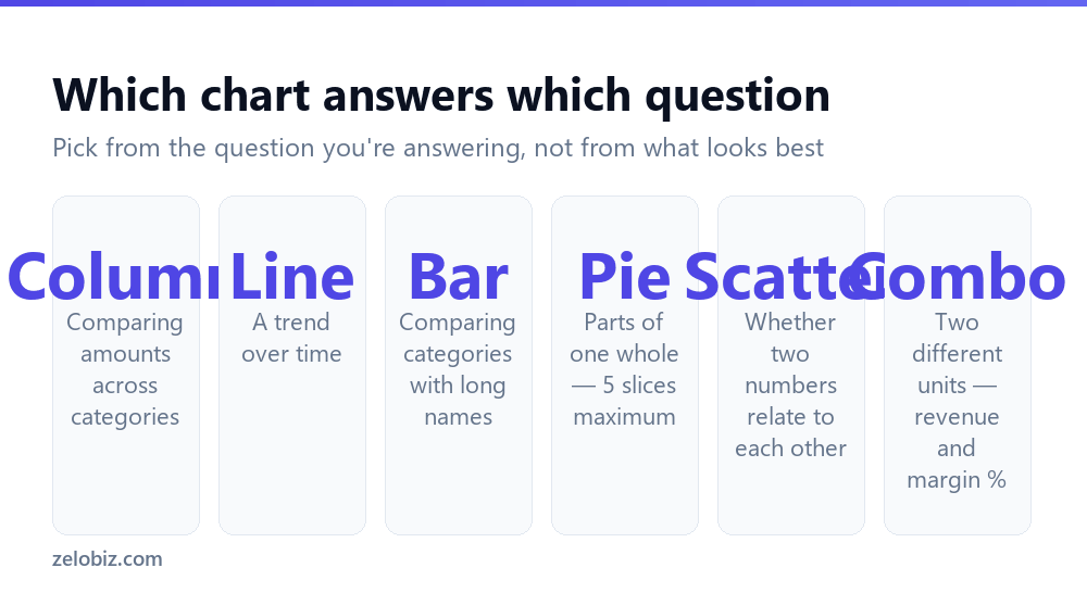
Line versus column is the choice people get wrong most. Use a line when the horizontal axis is continuous — dates, months, ages — because the line implies the values connect. Use columns when the categories are discrete and unrelated, like product names or regions, where drawing a line between them would suggest a progression that doesn’t exist.
The pie chart problem
Pie charts get used far more than they should and work in a narrow set of cases.
They’re fine for two to five parts of one genuine whole — market share, budget split by department. They fail beyond that because human eyes are poor at comparing angles. Two slices at 18% and 21% look identical in a pie and are obviously different as bars.
They also fail when the parts don’t sum to anything meaningful. Sales for five unrelated products aren’t ‘parts of a whole’ in any useful sense — a column chart says more.
If you have more than five categories, use a bar chart sorted largest to smallest. It’s more readable, comparisons are exact, and it handles twenty categories without difficulty.
Axes, and the one that misleads
Excel picks axis ranges automatically and its choice is often reasonable. On bar and column charts it’s occasionally dishonest.
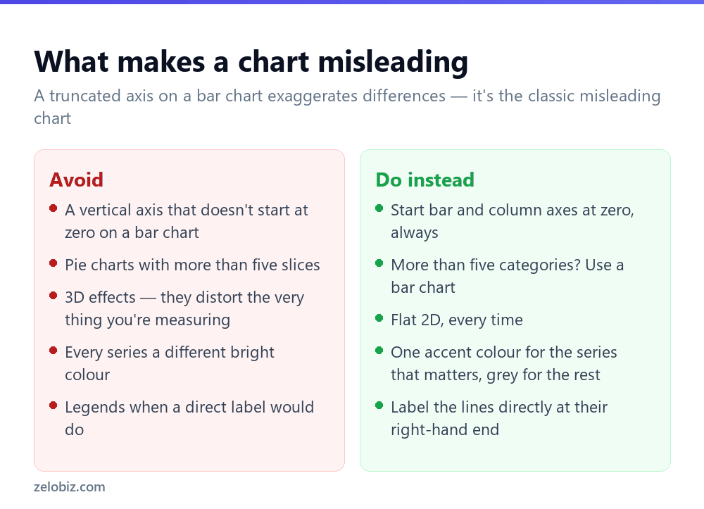
If your values run 98, 99, 101, 102, Excel may start the vertical axis at 97 rather than zero. The bars then differ enormously in height while the underlying numbers differ by about 4%. This is the classic misleading chart, and Excel produces it by default without anyone intending to deceive.
Bar and column charts must start at zero, because the length of the bar is what encodes the value. Right-click the axis, choose Format Axis, and set Minimum to 0.
Line charts don’t have to. A line encodes change rather than magnitude, so zooming in on the relevant range is legitimate and often clearer — a share price chart starting at zero would waste most of the plot area.
⚠️ Watch out: If someone hands you a chart where small differences look dramatic, check the axis minimum first. It’s the most common way charts mislead, deliberately or not.
Making it readable
A default Excel chart carries a lot of ink that doesn’t help. Removing things improves it more than adding things.
Delete the legend when you have one series — the title already says what it is. With two or three lines, label them directly at their right-hand ends instead; the reader’s eye doesn’t have to travel to a key and back.
Thin out the gridlines. Excel’s default horizontal lines are usually fine, but vertical ones rarely add anything. Click and delete.
Use one accent colour. If a chart has a point to make, colour the series that makes it and set everything else to grey. A chart where every series is a different bright colour tells the reader nothing about where to look.
Write a title that states the finding, not the subject. ‘Q3 revenue fell 12% in the North’ is more useful than ‘Revenue by Region’. The chart already shows the subject; the title should tell people what they’re meant to notice.
💡 Pro tip: Click the chart and press the + button at its top-right for the Chart Elements menu — the fastest route to axis titles, data labels and trendlines without hunting through ribbons.
Charts that update themselves
A chart built on a fixed range like A1:B20 won’t include row 21 when you add it. You have to edit the source each time, and eventually someone forgets.
Convert the data to a Table with Ctrl+T before creating the chart. Tables expand automatically as rows are added, and any chart built on one expands with it. Nothing to maintain.
This matters most for anything recurring — a monthly report, a dashboard someone else updates. Two seconds at the start removes a whole category of ‘the chart is missing last month’ problems.
Two series with different units
Revenue in thousands and margin as a percentage on the same chart: plotted together, the percentage is a flat line along the bottom because 12 is invisible next to 45,000.
The answer is a combo chart with a secondary axis. Select your data, then Insert › Combo Chart › Custom Combination. Set revenue to Clustered Column, set margin to Line, and tick Secondary Axis beside the margin series.
Label both axes clearly when you do this. A chart with two vertical scales and no labels is genuinely ambiguous, and readers will assume the wrong one.
Getting the chart out of Excel
For a document or a slide, right-click the chart and choose Copy, then in Word or PowerPoint use Paste Special.
Paste as a picture if the chart is final — it can’t break, it can’t accidentally update, and it always looks the way you left it. Paste with a link if the numbers will change before the deadline, and it refreshes from the workbook.
Linked charts break when the Excel file moves or is renamed, which is a common way a presentation shows an error on the morning it’s needed. If in doubt, paste as a picture and update it manually.
- ✓Lay out data with headers and no blank rows before charting
- ✓Start bar and column axes at zero
- ✓Use a bar chart instead of a pie beyond five categories
- ✓Build on a Table so the chart grows with the data
- ✓Title the chart with the finding, not the subject
- ✕Including subtotal rows in the chart selection
- ✕Using 3D effects — they distort what you’re measuring
- ✕Pie charts with ten slices
- ✕Colouring every series differently with no focus
- ✕Pasting a linked chart into a deck you’ll present elsewhere
Frequently asked questions
How do I create a graph in Excel?
Select your data including headers, then go to Insert and click Recommended Charts. Excel reads the shape of your data and suggests suitable types. Use the + button beside the chart to add axis titles and labels.
Which chart type should I use?
Line for change over time, column for comparing categories, bar when category names are long, scatter to test whether two numbers relate, and pie only for parts of one whole with five slices or fewer.
Why does my Excel chart look wrong?
Usually the data layout. Blank rows, merged cells or a subtotal row inside the selection all distort the result. Fix the layout before adjusting chart settings.
How do I make a chart update automatically?
Convert the data range to a Table with Ctrl+T before creating the chart. Tables expand as you add rows, and any chart built on one expands too.
Should a chart axis start at zero?
Bar and column charts, yes — the bar length encodes the value, so a truncated axis exaggerates differences. Line charts don’t need to, because they show change rather than magnitude.
How do I plot two different units on one chart?
Use a combo chart. Insert, Combo Chart, Custom Combination, then set one series to Line and tick Secondary Axis beside it. Label both axes so readers know which is which.
- →Clean the source data first — how to remove duplicates in Excel
- →Order it before charting: how to sort in Excel
- →Merged cells break chart sources — how to merge cells in Excel
- →Pull the figures together with how to use VLOOKUP