
To make a chart in Google Sheets, select the data range to chart (including header labels), go to Insert > Chart, and Sheets automatically analyzes the data and inserts a chart. Check the Chart type dropdown in the Chart editor’s Setup tab, since Sheets’ automatic suggestion isn’t always the right fit — a line chart for trends over time, a bar chart for comparing categories, a pie chart for parts of a whole, or a scatter chart for a relationship between two variables. Customize titles, colors, and labels in the Customize tab.
Choosing the right chart type
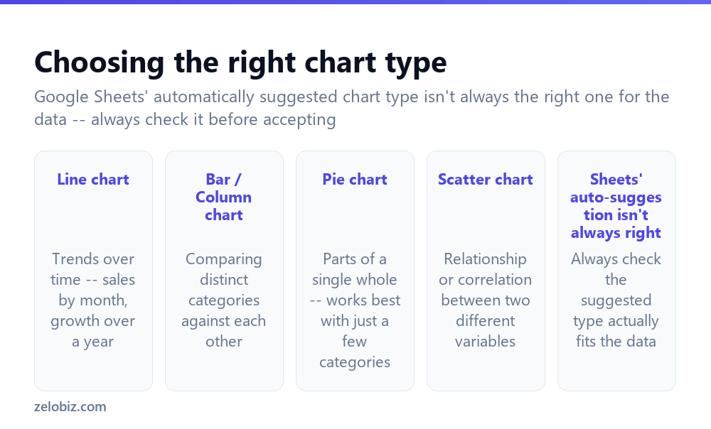
Line chart — best for showing trends over time, like sales figures by month or growth across a full year, where the sequence and direction of change matters.
Bar / Column chart — best for comparing distinct categories against each other, like revenue by product line or votes by candidate.
Pie chart — best for showing parts of a single whole, and works best specifically with just a few categories; too many slices make a pie chart genuinely hard to read at a glance.
Scatter chart — best for showing a relationship or correlation between two different variables, like advertising spend versus resulting sales.
Sheets’ auto-suggestion isn’t always right — always check that the automatically suggested chart type actually fits what the data is meant to communicate, rather than accepting the default without reviewing it.
Google Sheets’ automatically suggested chart type is a reasonable starting guess, not a guarantee of the right fit — always check the Chart type dropdown and switch it if the automatic choice doesn’t actually match what the data is meant to show.
Making a chart
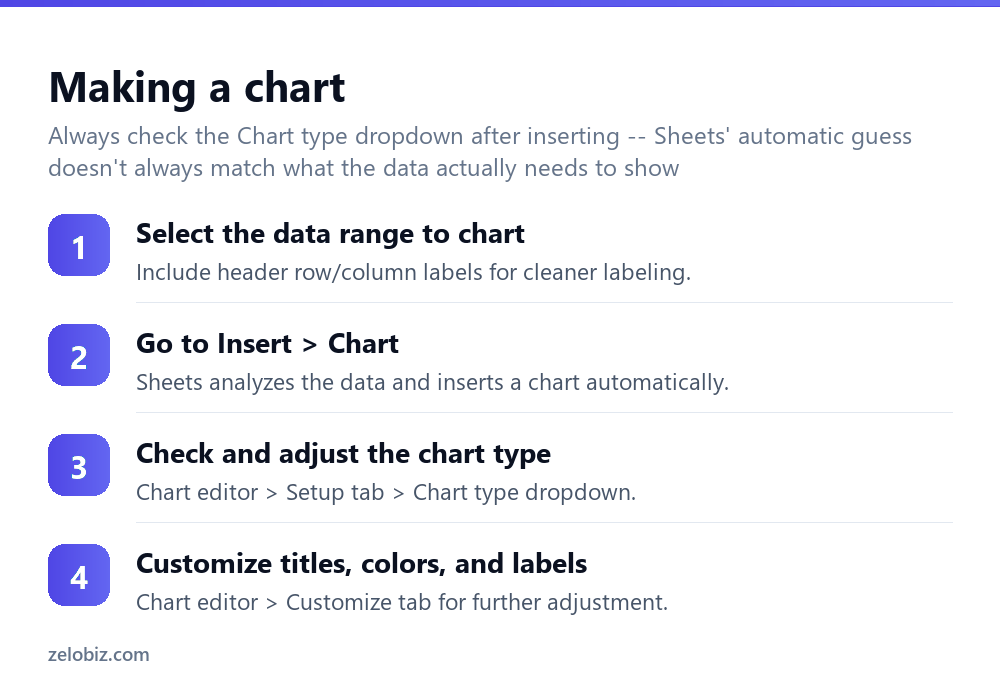
Select the data range to chart — including header row or column labels where possible, since these become the chart’s automatic labels rather than generic placeholders.
Go to Insert > Chart — Sheets analyzes the selected data and inserts a chart automatically, using its best guess at an appropriate type.
Check and adjust the chart type — within the Chart editor’s Setup tab, using the Chart type dropdown to switch to a more fitting type if the automatic suggestion doesn’t actually match the data’s purpose.
Customize titles, colors, and labels — within the Chart editor’s Customize tab, adjusting the chart title, axis labels, colors, and other visual details as needed.
Keeping a chart updated as data grows
A chart built from a specific, fixed cell range (like A1:B10) doesn’t automatically expand to include new rows added below that range later — new data added at row 15, for instance, simply won’t appear on a chart still referencing only rows 1 through 10. For data expected to keep growing over time, selecting the data as a named range or formatted as a table before charting, or periodically updating the chart’s data range manually, keeps the chart genuinely current rather than silently excluding new entries.
Editing a chart after it’s been created
Double-clicking any existing chart reopens the Chart editor, where the data range, chart type, and all customization options remain fully editable at any time — there’s no need to delete and rebuild a chart from scratch just to make an adjustment. This makes iterating on a chart’s exact appearance, or correcting an initially wrong chart type choice, a quick fix rather than a full redo.
A worked example: choosing between a line chart and a bar chart
Say someone has monthly sales figures for the past year and wants to chart them for an upcoming team meeting, and Sheets’ automatic suggestion after selecting the data and using Insert > Chart comes back as a bar chart.
Since the actual point being made is how sales have trended and changed across the year — growing, shrinking, or staying flat over time — rather than comparing twelve unrelated, independent categories against each other, a line chart is genuinely the better fit here, even though the automatic suggestion defaulted to bar. They switch it manually in Chart editor > Setup > Chart type, and the line chart immediately makes the actual trend — a dip in the summer months, a strong recovery by year-end — considerably more visually obvious than the bar chart did, where each month sat as a disconnected column with no visual sense of the trend connecting them.
For a follow-up chart breaking down that same year’s total sales by product category instead, the situation reverses — now genuinely comparing a handful of distinct, unrelated categories against each other, which is exactly what a bar chart communicates most clearly, and a line chart would actually be the wrong, confusing choice for this specific second question.
This illustrates the core judgment call: the right chart type depends specifically on what question the chart is meant to answer — “how did this change over time” points toward a line chart, while “how do these things compare to each other” points toward a bar chart, even when the underlying data could technically be visualized either way.
Combining multiple data series on one chart
For comparing more than one metric at once — this year’s sales against last year’s, for instance — selecting both data columns together before inserting the chart produces a chart showing both as separate series (typically as two distinct lines, or two sets of bars grouped by month), rather than needing to build and manage two entirely separate charts side by side.
Within the Chart editor’s Setup tab, additional data series can also be added to an already-existing chart via the “Add series” option, useful for extending a chart after new comparison data becomes available rather than rebuilding the whole chart from scratch to incorporate it.
Moving a chart to a separate sheet or document
A chart inserted into a Sheet can be moved to its own dedicated sheet (via the chart’s own three-dot menu > “Move to own sheet”), useful when a chart needs to be the clear, singular focus of a specific view rather than sitting alongside the raw data table. A chart can also be copied directly into a Google Doc or Slides presentation, where it remains genuinely linked back to the original Sheet — updating in the destination document when the source data changes, provided the link update option is confirmed rather than pasted as a static, disconnected image with no live connection.
Chart not looking right?
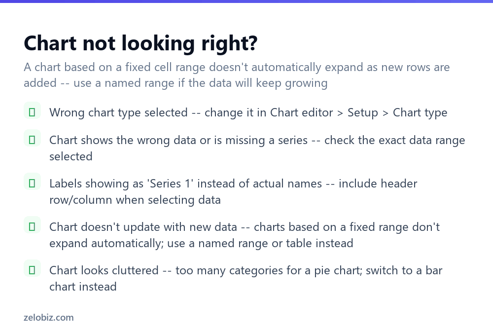
Wrong chart type selected — change it directly in Chart editor > Setup > Chart type, without needing to rebuild the chart from scratch.
Chart shows the wrong data or is missing a series — check the exact data range selected in the Setup tab, which may not match what was originally intended.
Labels showing as “Series 1” instead of actual names — include the header row or column when originally selecting the data range, since this is what Sheets uses to generate meaningful labels.
Chart doesn’t update with new data — charts based on a fixed range don’t expand automatically; use a named range or formatted table instead if the data will keep growing over time.
Chart looks cluttered — often caused by too many categories on a pie chart specifically; switching to a bar chart handles a larger number of categories considerably more legibly.
- ✓Check the Chart type dropdown after inserting, rather than accepting the automatic default
- ✓Include header labels when selecting data for cleaner, more meaningful chart labels
- ✓Use a named range or table if the underlying data will keep growing over time
- ✓Choose a bar chart over a pie chart once there are more than a handful of categories
- ✓Edit an existing chart directly rather than deleting and rebuilding it from scratch
- ✕Assuming Sheets’ automatically suggested chart type always fits the data correctly
- ✕Selecting a data range without headers and ending up with generic ‘Series 1’ labels
- ✕Expecting a chart based on a fixed range to automatically include newly added rows
- ✕Using a pie chart for data with too many categories to display legibly
- ✕Deleting and rebuilding a chart from scratch for a change that could be edited directly
Frequently asked questions
How do I make a chart in Google Sheets?
Select the data range, go to Insert > Chart, and Sheets inserts one automatically — check and adjust the chart type in the Chart editor’s Setup tab.
What chart type should I use in Google Sheets?
Line charts for trends over time, bar charts for comparing categories, pie charts for parts of a whole, and scatter charts for relationships between two variables.
Why does my Google Sheets chart show ‘Series 1’ instead of real labels?
The data range selected didn’t include header row or column labels — include them for Sheets to generate meaningful labels automatically.
Why doesn’t my chart update when I add new data?
Charts based on a fixed cell range don’t expand automatically. Use a named range or formatted table if the data will keep growing.
Can I change a chart’s type after creating it?
Yes, double-click the chart to reopen the Chart editor and change the type in the Setup tab at any time.
Why does my pie chart look cluttered?
Too many categories make a pie chart hard to read. Switch to a bar chart, which handles more categories considerably more legibly.
- →Build the underlying data first: how to use Google Sheets
- →Collect chart-ready data via a form: how to make a Google Form
- →Store and share the finished chart: how to use Google Drive
- →Export a report with the chart as PDF: how to convert Google Doc to PDF