

An AI chart Excel question is one of the few spreadsheet requests with a genuinely correct answer, because chart choice is determined by what the data is rather than by taste. That makes it unusually reliable ground, in Excel and in Google Sheets alike.
The catch is that people ask the wrong question. Which chart suits this data has an answer. Make this look professional does not.
Short answer: Describe what your data is rather than asking for a chart. Time series takes a line, category comparison takes a sorted bar, parts of a whole take a stacked bar rather than a pie, and two related variables take a scatter. AI answers that question well. It cannot tell you whether the result is good news.
Why the Default Chart Is Usually Wrong

Both Excel and Google Sheets guess a chart type from the shape of your selection. They see two columns of numbers and offer a clustered column, because that is a safe guess for arbitrary data.
Safe is not the same as right. The most common mistake this produces is a column chart for a time series, which makes a trend far harder to read than a line would. Twelve months as twelve separate bars asks the reader to compare heights rather than follow a shape.
The second most common is a pie chart with too many slices. Beyond about three segments, humans cannot compare angles reliably, and a sorted bar chart conveys the same information immediately.
The Four-Question Rule
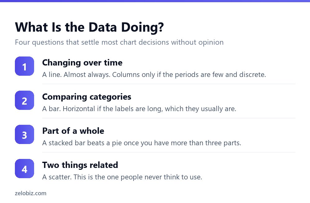
You can settle most chart decisions without asking anything, and knowing the rule makes you better at spotting when AI has answered badly.
Is it changing over time?
Use a line. Time is continuous, and a line shows continuity. The exception is a small number of discrete periods, such as four quarters, where columns are acceptable because there is no real shape to follow.
Are you comparing categories?
Use a bar, and sort it by value rather than leaving it alphabetical. Horizontal bars if the labels are more than a word or two, which they almost always are. Rotated text on a vertical axis is a readability problem you can simply avoid.
Is it parts of a whole?
A pie works for two or three segments. Beyond that use a stacked bar, or simply a sorted bar with the total stated in the title, which is usually clearer than either.
Are you showing a relationship between two variables?
A scatter, and this is the one people never reach for. If you are asking whether spending more correlates with better results, a scatter answers it instantly and no other chart type does.
What to Ask, and What Not To

The reliable questions are structural. The unreliable ones are aesthetic or interpretive.
Describe your columns and ask which chart type suits them. Say column A holds month-end dates and column B holds revenue, and the answer is a line chart with a correctly formatted date axis. That is a fact about your data, not a preference.
Asking it to make a chart look professional produces generic advice about removing gridlines and choosing muted colours. Not wrong, not specific to you, and not worth the round trip.
The genuinely useful troubleshooting questions
- Why does my line chart have a gap? Usually blanks in the source, or dates stored as text so the axis is treating them as categories.
- Why are my dates spaced wrongly? The classic symptom of a text date column. The axis is plotting them evenly rather than by actual interval.
- How do I add a secondary axis without misleading anyone? A real question with a real answer about scale and labelling.
- Why does my chart include a blank category? A blank row inside the selected range, which is easy to miss and always looks like a chart bug.
💡 Pro tip: The date axis problem is worth learning to recognise on sight. If your line chart spaces January and March the same distance apart as January and February, your dates are text. No chart setting fixes that, because the problem is in the data.
Describe the Columns, Not the Chart
The difference between a useful answer and a generic one comes down to what you say about your data, and it takes one extra sentence.
Notice what the better requests have in common. Each says what the columns hold, how many values there are, and what the reader should be able to see. Those three facts determine the chart, and none of them can be inferred from a selection.
Say how many, not just what
The count matters as much as the type. Six categories and sixty categories want different treatments, and a request that omits the number frequently produces advice suited to the wrong one.
Sixty categories in a bar chart is unreadable. That situation usually wants the top ten with everything else grouped, and AI will suggest exactly that if it knows the count.
Charts in a Report Somebody Else Reads
One extra consideration applies once a chart leaves your screen, and it is worth settling before you build it rather than after someone queries it.
- State the period in the title. Not in a caption underneath, which gets separated when the image is pasted into a deck. In the chart title itself.
- Say what the axis is measuring. Revenue in thousands and revenue in units look identical if nobody labelled it.
- Do not start a value axis anywhere but zero unless you say so prominently. A truncated axis exaggerates change, and readers assume zero.
- Sort by value, not alphabetically, unless the categories have a natural order such as months or sizes.
The truncated axis point is the one that causes arguments. It is not always wrong, and sometimes it is the only way to see a small but real movement. But it changes how dramatic the chart looks, and anyone who notices it after the fact will assume it was deliberate.
📊 Note: If you do truncate, say so in the axis label rather than hoping nobody checks. Stating it plainly costs you nothing and removes the entire question.
The Question It Should Not Be Asked
Asking what story the data tells, or whether a result is good, produces confident narrative from something with no knowledge of your targets, your market or last year.
It will describe the shape of the line accurately and attach a judgement to it. Sales declined in Q3 is a fact. Sales declined worryingly in Q3 is an opinion formed without knowing that Q3 is always your slowest quarter.
This is the same trap as AI summaries of pivot tables, which our guide to AI pivot table summaries covers in more depth. The output reads like analysis and is description with adjectives attached.
⚠️ Watch out: Be especially careful when a chart is going into a report someone else will read. A generated caption saying performance improved significantly will be quoted, and you will be the one asked to justify the word significantly.
Fix the Data, Not the Chart
A large share of chart problems are data problems wearing a disguise, and no amount of chart configuration solves them.
If you ask AI to fix the chart in any of these cases, you may get a workaround that hides the symptom while the underlying data stays wrong. Describe the symptom and ask what could cause it, rather than asking it to make the chart look right.
📊 Note: Text dates are the single most common one. They are also invisible until you chart them, which is why a chart is often the first place a data quality problem becomes obvious. Treat a strange-looking axis as information rather than an annoyance.
Common Questions
Can AI choose the right chart type for my data?
Yes, and it is one of the more reliable spreadsheet questions to ask, because chart choice is determined by what the data is rather than by taste. Describe your columns explicitly, saying which holds dates, which holds categories and which holds values.
What chart should I use for data over time?
A line chart, in nearly all cases, because time is continuous and a line shows continuity. Columns are acceptable for a small number of discrete periods such as four quarters, where there is no real shape to follow.
Why is a pie chart usually the wrong choice?
Because people cannot compare angles reliably beyond about three segments. A sorted bar chart conveys the same information immediately, and stating the total in the title preserves the part-of-whole meaning.
Why does my line chart space the dates unevenly?
Almost always because the dates are stored as text rather than as real dates, so the axis treats them as evenly spaced categories. No chart setting fixes this. The fix is converting the column to genuine date values.
Should I ask AI what my chart shows?
Ask it to describe what changed, not whether the result is good. It has no knowledge of your targets or seasonality, so any judgement word it attaches is invented context, and those are the sentences most likely to be quoted back at you.
Why does my chart have a blank category?
There is an empty row inside the range you selected. It looks like a chart bug and is actually a selection problem, which is why widening the selection to whole columns often introduces it.
Is the chart Excel suggests usually correct?
Not reliably. It guesses from how many columns you selected and whether they hold text or numbers. It does not know whether your first column is a date, a category or an ID, and that is exactly what should determine the chart type.
The Short Version
- →Chart choice has right answers, which makes it good ground for asking AI.
- →Describe what your columns hold. The chart follows from the data type.
- →Time takes a line. Categories take a sorted bar. Two variables take a scatter.
- →A pie beyond three slices should be a bar with the total in the title.
- →Ask structural questions. Do not ask whether the result is good.
- →Unevenly spaced dates mean text dates. Fix the data, not the chart.