

To make a pivot table in Excel, click any cell in your data, go to Insert › PivotTable › OK, then drag fields from the list into the Rows, Columns, Values, and Filters boxes. Rows decides what each line represents, Values decides what gets summarised, and the same field can go in different boxes depending on what question you’re asking.
What your data needs before you start
A PivotTable reads your data as a table, and it needs a specific shape to do that correctly.
One header row, with a text label in every column — no blank column headers. No blank rows inside the data, which Excel reads as the end of the table. No merged cells, which break the row-by-row structure a PivotTable relies on. And ideally the data is an actual Excel Table (Ctrl+T), so the pivot’s source range expands automatically as rows are added.
💡 Pro tip: If your PivotTable seems to be missing recent rows, this is almost always the cause — the source range was fixed at creation time and didn’t grow with the data. Converting to a Table first prevents it.
The four boxes
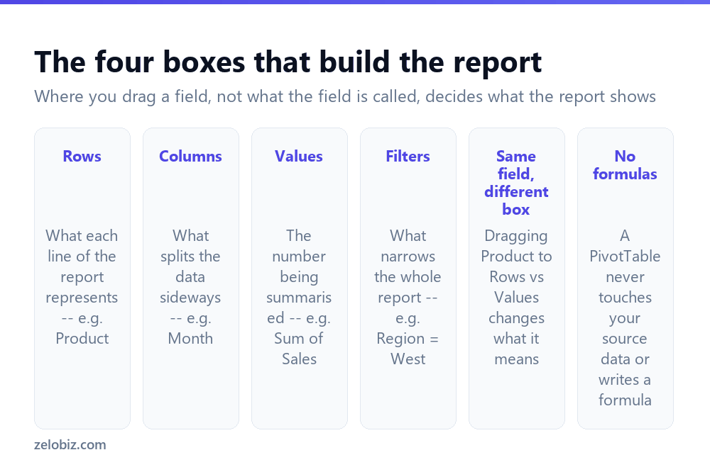
This is the part that actually determines what the report shows, and it’s worth understanding properly rather than dragging things until it looks right.
Rows — each unique value becomes a line down the left side. Drag Product here and you get one row per product.
Columns — each unique value becomes a heading across the top, splitting the report sideways. Drag Month here and every product row spreads into one column per month.
Values — the number being summarised, and the field that decides what fills the grid. Drag Sales here and it defaults to Sum; a text field dropped here defaults to Count instead, since text can’t be summed.
Filters — narrows the entire report without appearing as a row or column. Drag Region here to get a dropdown that limits everything below it to one region at a time.
The same field behaves completely differently depending on the box. Product in Rows lists every product. Product in Values (as Count) tells you how many products exist. Same field, different question.
Building your first one
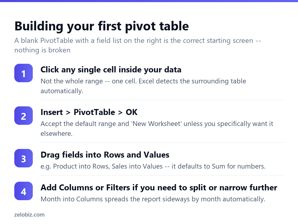
Click a single cell anywhere inside your data — not a full selection, just one cell. Excel uses that to detect the boundaries of the table automatically.
Insert › PivotTable. The dialog that appears shows a detected range; check it covers your actual data before clicking OK, especially if there are blank rows Excel might have stopped at early.
You land on a blank grid with a PivotTable Fields panel on the right — this is correct, not an error. Drag fields from the top of that panel into the four boxes at the bottom to start building the report.
Start with just Rows and Values — one dimension summarised one way. Add Columns or Filters once the basic version looks right; building all four at once makes it harder to spot which field caused an unexpected result.
Changing how Values are summarised
A number field in Values defaults to Sum. To change it, click the field inside the Values box (or right-click a number in the pivot itself) and choose Value Field Settings. Average, Count, Max, Min, and several others are available from the same dialog.
The same field can appear in Values more than once with different summaries — Sales as Sum and Sales as Average, side by side in the same report, which is useful for comparing total volume against typical order size in one view.
Grouping dates and numbers
Drop a date field into Rows or Columns and Excel usually offers to group it automatically — by month, quarter, or year, rather than listing every individual date as a separate row. Right-click any date in the pivot and choose Group to change the grouping manually.
Numeric fields can be grouped the same way — ages into 10-year bands, order sizes into $0-50/$50-100/$100+ buckets. Right-click a number in the row area, choose Group, and set the starting value, ending value, and interval.
Refreshing when the source data changes
A PivotTable is a snapshot, not a live formula. Editing the source data doesn’t update the pivot automatically — you have to tell it to refresh.
Right-click anywhere inside the pivot and choose Refresh, or use PivotTable Analyze › Refresh on the ribbon. If new rows were added below the original range and the source isn’t a Table, refresh alone won’t pick them up — you’d need to update the source range via PivotTable Analyze › Change Data Source.
💡 Pro tip: Converting the source data to a Table (Ctrl+T) before building the pivot avoids this entirely — the Table expands automatically and Refresh always sees the full range.
Sorting and filtering inside the pivot
A PivotTable’s row and column headers carry their own dropdown filter arrows, separate from any filter on the source data. Click the arrow next to a Row Labels field to tick or untick individual values, or use the search box inside the dropdown to find one specific item in a long list.
Sorting works the way you’d expect on the row labels themselves — alphabetical or reverse — but you can also sort by a Values column instead, which is usually more useful: right-click any number in the Values area and choose Sort › Largest to Smallest to rank rows by the metric rather than alphabetically.
A Slicer (Insert › Slicer) does the same job as a Filter box but as a set of visible clickable buttons instead of a dropdown — useful when the report will be viewed by someone who might not think to look for a small filter arrow, or when several PivotTables need to be filtered together by the same field.
PivotCharts
Any PivotTable can generate a matching chart that updates alongside it — select a cell inside the pivot and choose PivotTable Analyze › PivotChart, then pick a chart type as normal. Filtering or re-arranging the underlying PivotTable updates the chart automatically, since it’s reading the same summarised data rather than a separate copy.
This is usually faster than building a chart from a manual SUMIF-based summary table, because rearranging the PivotTable’s fields to answer a new question updates the chart immediately rather than requiring the chart’s source range to be redefined by hand.
When something looks wrong
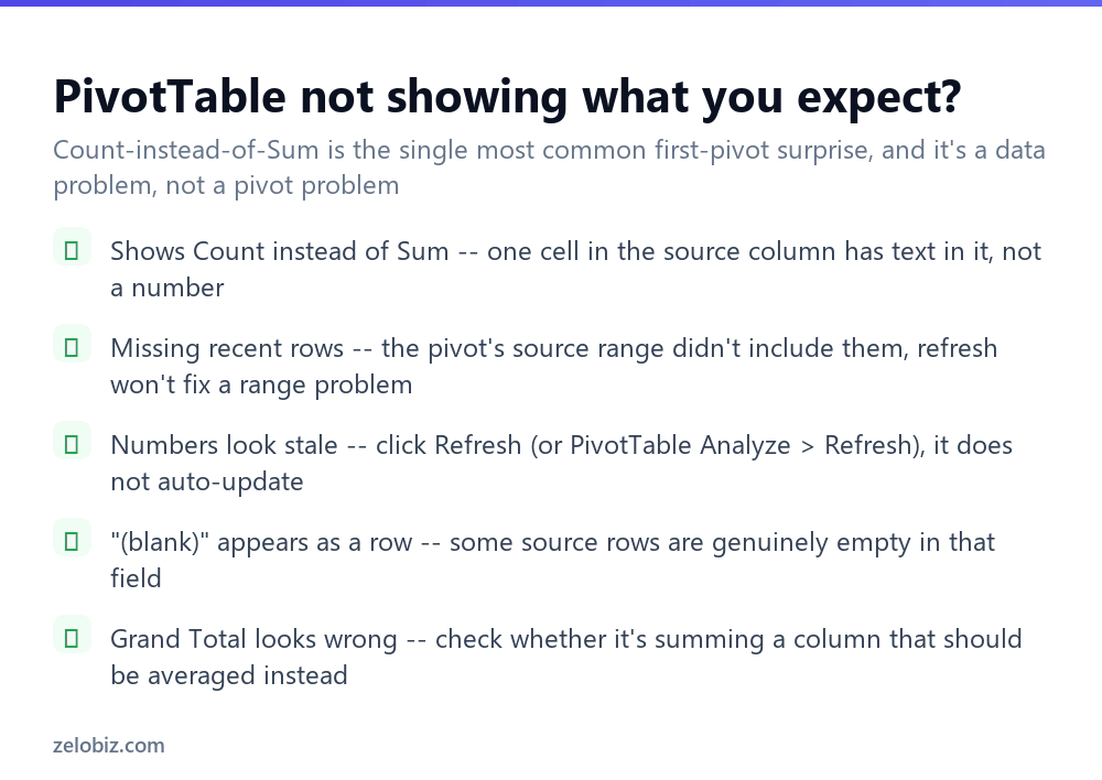
Shows Count instead of Sum — somewhere in that column, even one cell, contains text rather than a number. Excel can’t sum text, so it silently switches the whole field to Count. Sort the source column to find the offending cell, or check for a stray space or unit label typed alongside a number.
“(blank)” appears as a row — some source rows genuinely have nothing in that field. It’s not an error; it’s an accurate reflection of missing data, and worth investigating in the source rather than hiding in the pivot.
Grand Total looks wrong — check what it’s actually totalling. A Grand Total on an Average field averages the row averages, which is not the same as the average of every individual value if the rows have different counts.
- ✓Convert source data to a Table (Ctrl+T) before building the pivot
- ✓Start with just Rows and Values, then add Columns and Filters
- ✓Refresh manually after editing source data
- ✓Right-click a number field to change Sum to Average, Count, etc.
- ✓Group dates by month/quarter and numbers into bands via right-click
- ✕Leaving blank rows inside the source data range
- ✕Assuming a PivotTable updates itself when the data changes
- ✕Dragging every field into every box at once on the first attempt
- ✕Ignoring a switch from Sum to Count — it means a text value snuck into a number column
- ✕Merging cells in the source data before pivoting it
Frequently asked questions
How do I create a pivot table in Excel?
Click any cell in your data, go to Insert, PivotTable, OK, then drag fields into the Rows, Columns, Values and Filters boxes in the field list panel.
Why does my pivot table show Count instead of Sum?
At least one cell in that column contains text rather than a number, which forces Excel to switch the whole field from Sum to Count.
Why isn’t my pivot table showing new rows I added?
The pivot’s source range was fixed when it was created. Refresh alone won’t include rows added beyond that range — use Change Data Source, or convert the source to a Table first.
How do I refresh a pivot table?
Right-click anywhere inside it and choose Refresh, or use PivotTable Analyze, Refresh on the ribbon. It does not update automatically when source data changes.
Can the same field appear twice in a pivot table?
Yes. Add the same field to Values twice with different summaries, e.g. Sum of Sales and Average of Sales, to compare both in one report.
How do I group dates in a pivot table?
Right-click any date in the pivot and choose Group, then select Months, Quarters, or Years instead of listing every individual date.
- →Add up matching rows without a pivot: how to use SUMIF in Excel
- →Count rows before you pivot them: how to count cells in Excel
- →Look up individual values: how to use INDEX MATCH in Excel
- →Highlight outliers in the source data: how to use conditional formatting in Excel